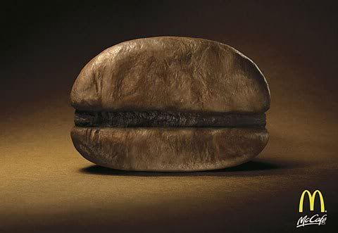
The first image is of a McDonald's ad for their coffee while the second is about a mattress sale. The first ad is very simple the only elements being the coffee bean and logo. Yet it looks very attractive and does draw attention. This is possible because more effort can be placed to improving the quality of visual elements. There is more focus, and the subject of that focus looks great. Less visual elements was put into the ad, but the ad's effect on the audience is more.
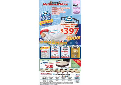
The second ad has a mass of information on it, mostly textual. There is barely any white space at all; everything looks like its all clogged up and crammed in together. People may notice the $387 for the mattress but everything else just falls into the background and will either go unnoticed or become annoying to look through. Good example of putting way too much information in an ad and probably getting little attention.
When it comes to selling something to people, whether it is a product, design or message, I suppose this phrase deals with not suffocating them with too much. There is a lot people can say but that means people will have to put in effort to get the message. It is much harder to simplify something without weakening the message. If that is achieved successfully, one will get more for less and vice versa.
No comments:
Post a Comment